Duo Lingo Real Glass Neon Logo Sign
Neon Logo Sign for Duolingo
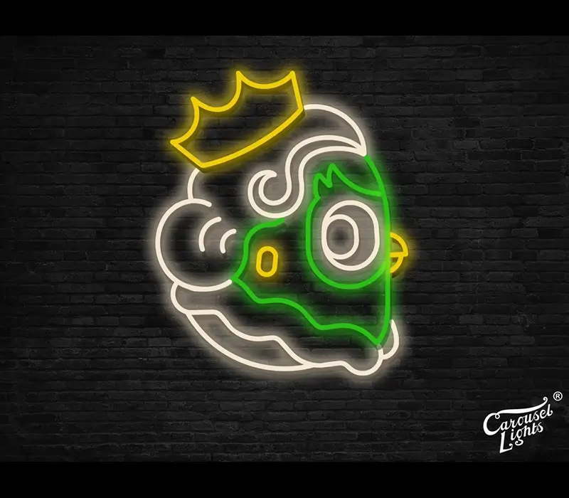
The team at Duolingo approached Carousel Lights and asked us to bring their localised Duolingo London logo to life with the Queen element to it. What an awesome brief to receive.
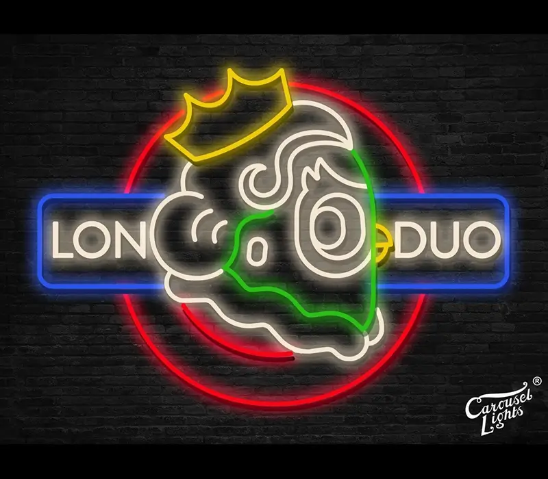
Duolingo London – sign design
The client sent us a photograph of the space that the neon was to be located in, along with dimensions of the space. That enabled us to produce different design options for the neon, with different degrees of complexity as well as different options for use of glass colour.
When designing neon signs, there are several consideration we make. Whilst the main objective is to maintain the integrity of the logo that we’re replicating, we need to consider what diameter glass we’ll use to make it, the tightest bends we can do with that glass and the colour availability of the neon.
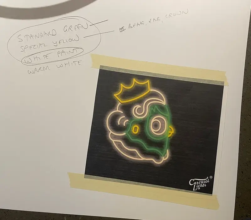
We looked at incorporating both the chicken and London Underground roundel, whilst also incorporating a crown to really bring it home to London. This led to a lot of complexity in the design, so the final design was the head and the crown with the use of 3 colours – warm white, yellow and green.
We supplied a mounting template in advance so that the client could locate it on the wall to get a real idea of the size of the neon once it was delivered.
How the neon sign was made
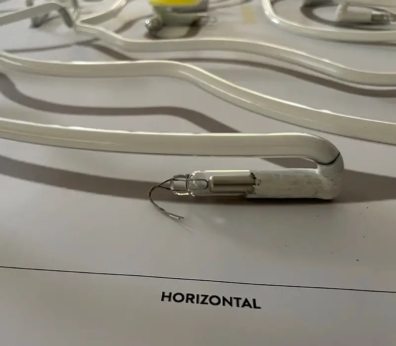
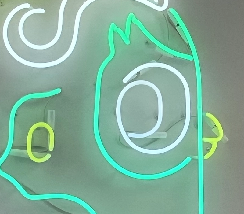
The neon starts off as 1.5m long lengths of straight glass tubing. We used warm white, green and yellow to achieve the different elements of the design. Once the main sections had been bent to follow the mirror-image pattern, the electrodes were attached to each section and then painted with black ‘blackout’ paint, with white paint then covering the black.
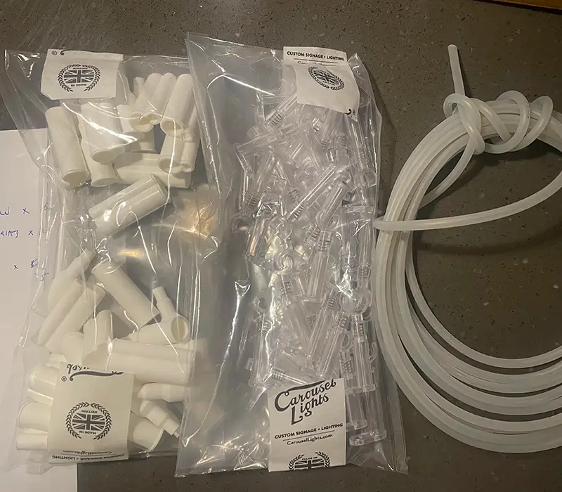
The neon sections were supplied with tube supports, white silicone covers, HT cable and a Hansen specialist neon transformer.
Date:
24th February 2026